Chart nodes: ask a concrete question of the current data
Use charts to inspect the data at a particular pipeline position: raw spectra before processing, normalized spectra afterward, actual fold membership after splitting, or synthetic variants after augmentation. They produce diagnostic artifacts, not numerical features for the model.
A raw and an SNV-processed view answer different questions. The raw view reveals gain and offset; the processed view reveals the surviving shape. A fold chart of 12 rows and three folds shows four validation rows per fold. It does not establish that group leakage is absent.
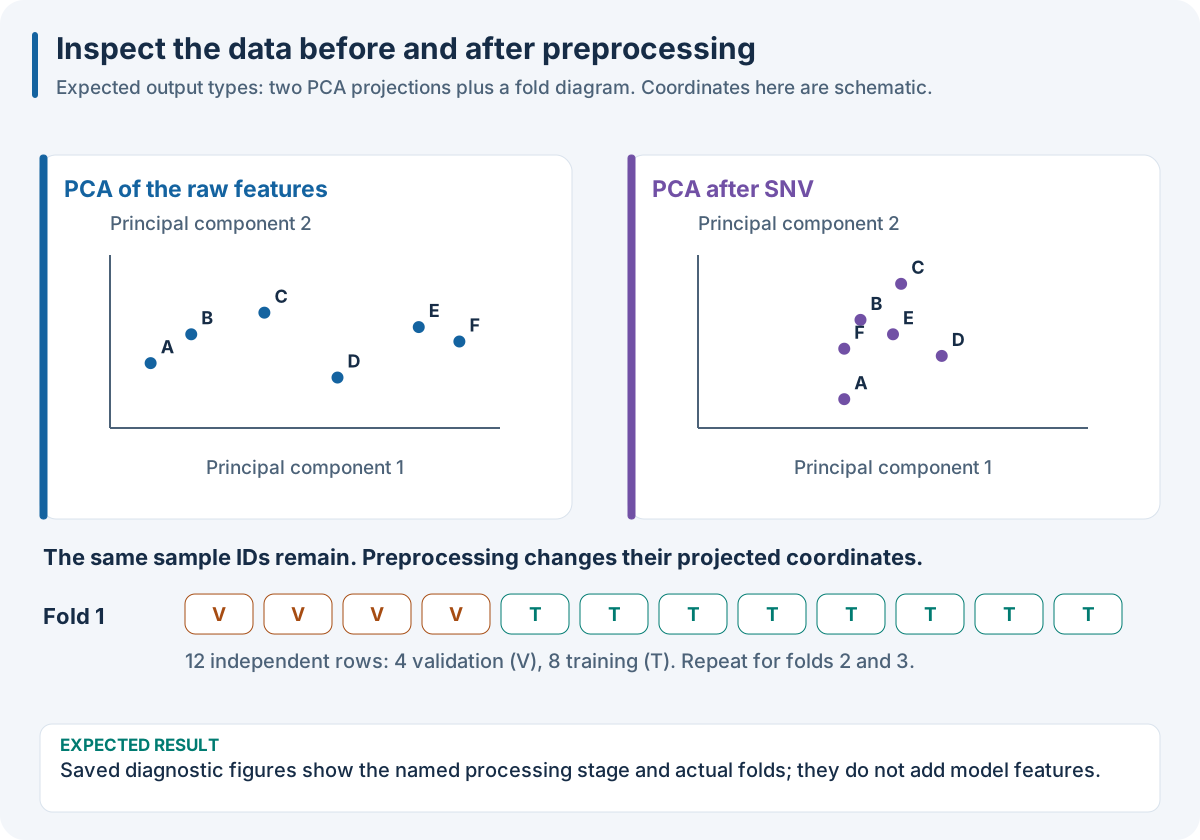
Two PCA views illustrate the change before and after SNV; the coordinates are schematic. The fold strip shows 4 validation rows and 8 training rows. Identify the plotted stage, units and population before interpreting a visual.
Worked recipe
Download dataset.json from 1. Run your first complete experiment. The JSON/YAML tabs define SDK pipeline files; the Python tab defines pipeline. The execution box below loads the same observations and runs the recipe.
{
  "pipeline": [
    {
      "chart_2d": {
        "method": "pca",
        "color_by": "y"
      }
    },
    {
      "class": "nirs4all.operators.transforms.StandardNormalVariate"
    },
    {
      "chart_2d": {
        "method": "pca",
        "color_by": "y"
      }
    },
    {
      "split": {
        "class": "sklearn.model_selection.KFold",
        "params": {
          "n_splits": 3
        }
      }
    },
    {
      "fold_chart": {
        "color_by": "y"
      }
    },
    {
      "model": {
        "class": "sklearn.cross_decomposition.PLSRegression",
        "params": {
          "n_components": 2
        }
      }
    }
  ]
}
pipeline:
- chart_2d:
    method: pca
    color_by: y
- class: nirs4all.operators.transforms.StandardNormalVariate
- chart_2d:
    method: pca
    color_by: y
- split:
    class: sklearn.model_selection.KFold
    params:
      n_splits: 3
- fold_chart:
    color_by: y
- model:
    class: sklearn.cross_decomposition.PLSRegression
    params:
      n_components: 2
from nirs4all.operators.transforms import SNV
from sklearn.model_selection import KFold
from sklearn.cross_decomposition import PLSRegression

pipeline = [
    {"chart_2d": {"method": "pca", "color_by": "y"}},
    SNV(),
    {"chart_2d": {"method": "pca", "color_by": "y"}},
    KFold(n_splits=3),
    {"fold_chart": {"color_by": "y"}},
    {"model": PLSRegression(n_components=2)},
]
JSON/YAML files and Python objects here use the Python SDK. The finite R/Octave/browser pipeline facade does not accept these SDK controller keywords and Python import paths. See 10. Run the same recipe in your language for native recipes in those hosts. Equivalent local plotting or filtering does not add the SDK node’s identity, fitting-scope or export behavior.
Choices and controls
Keyword (aliases) |
Question it answers |
Place it after |
|---|---|---|
|
Are observations separated in a 2D view/projection? |
The representation you want to inspect |
|
What does a third projection axis add? |
The representation of interest |
|
Is the target population uneven or truncated? |
Loading, target processing, or exclusion |
|
Which actual observations validate each fit? |
A splitter |
|
How variable are features across the cohort? |
Raw or transformed spectral stage |
|
Are variants plausible relative to originals? |
Sample augmentation |
|
What variation is introduced per origin? |
Sample augmentation |
|
Which rows were retained/excluded, and why? |
Exclusion |
Common option |
Purpose |
|---|---|
Projection |
Select the reduction and dimensions |
|
Explain which target/metadata distinguishes observations |
|
Limit displayed spectra; disclose sampling rather than implying every row is shown |
|
Show removal decisions where supported |
Target |
Choose the target-distribution presentation |
Augmentation |
Distinguish overlapping curves |
Options are chart-specific; see Visualization for the exact interfaces.
Expected result: saved visual diagnostics with the same data state, not a new feature matrix. In the DAG-ML save-charts workflow, chart HTML links to numeric CSV inputs and JSON fold/methodology data. Transformed charts describe the captured full-training refit representation, not out-of-fold features.
Try it: compare a chart before and after SNV. Which visible differences disappeared? Write a two-sentence interpretation including units and sample count.
Common mistake: reading PCA separation as predictive accuracy. A projection is a descriptive reduction; validate a model separately. Fold charts require folds, and augmentation charts require origin-linked variants.
Place a chart where its question can be answered
Chart nodes inspect the state at their pipeline position. A raw-spectrum chart describes the input; a chart after a derivative describes the derivative features. A fold chart belongs after folds exist, and an augmentation comparison belongs after synthetic samples and origin relations have been created.
Question |
Chart |
Interpretation limit |
|---|---|---|
Is target coverage uneven? |
|
Distribution alone does not establish representative sampling |
Are train and validation cohorts different? |
|
Projection overlap does not prove absence of leakage |
Are spectra unusually variable? |
|
Envelope extremes can hide sample-level subgroups |
Does augmentation remain plausible? |
|
Visually similar curves can still alter target semantics |
What was excluded? |
|
Removal changes the evaluated population |
Are sources or classes separated? |
|
A projection is a reduction, not a predictive score |
These outputs are diagnostics, not transformations fed to a learner. Host chart generation requires its plotting dependencies; it is not a guarantee that every binding can render an identical chart. DAG-ML chart projection and legacy chart controllers have different execution plumbing; unsupported requests fail according to their capability contract.
When publishing a chart, accompany it with its question, units, cohort, sample count and a text summary of the finding. Use labels or line patterns as well as colors. Provide data or a table when readers need exact values. A PCA chart should identify whether the projection was fitted for descriptive inspection or within a training-only evaluation protocol.
Worked source: sample filtering charts, augmentation charts.
Run the recipe on the downloadable observations
Install the full Python SDK as described in 1. Run your first complete experiment, execute the Python tab in the Worked recipe section to define pipeline, then run this box. It reads the first experiment’s complete single-source dense fixture into its numeric SDK arrays. The fixture has 12 rows × 7 features, one target and training rows only; its figures’ small numeric examples explain the mechanisms independently of the fixture’s fitted predictions.
import json
from pathlib import Path
import numpy as np
import nirs4all
from sklearn.model_selection import KFold
from sklearn.cross_decomposition import PLSRegression

# Download dataset.json, then run the Python tab in the Worked recipe section.
observations = json.loads(Path("dataset.json").read_text())["dataset"]
X = np.asarray(observations["sources"][0]["array"]["values"], dtype=float)
y = np.asarray(observations["y"]["values"], dtype=float)
complete_pipeline = pipeline
result = nirs4all.run(
    complete_pipeline, (X, y), engine="dag-ml",
    workspace_path="workspace-node-example", verbose=0,
)
validation = result.predictions.filter_predictions(partition="val")
print(validation[0]["val_score"])
Expected: a completed three-fold calibration, finite validation scores, and stored results in workspace-node-example. With no independent test rows in this teaching fixture, inspect val_score; a final-test convenience score may be absent/NaN. The chart recipe also saves its diagnostics. Keep your own study’s sample/source identities and group metadata when replacing this simple fixture.